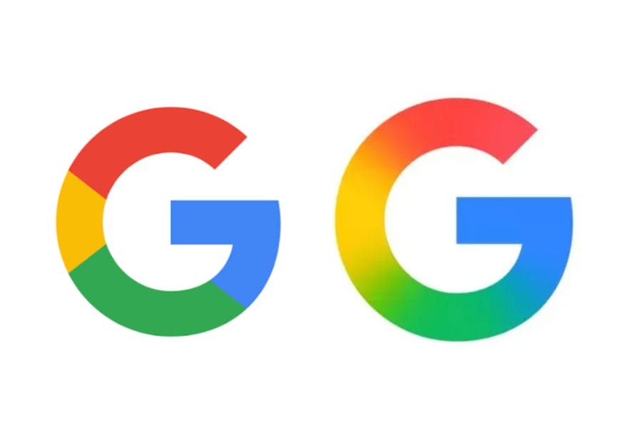
Google has quietly refreshed its iconic “G” logo marking the first major visual update in nearly ten years. The redesigned logo, now featuring a subtle gradient blend of the traditional red, yellow, green, and blue colors, is currently visible on the Google app for iOS and Pixel phones.
The update was first spotted by 9to5Google, noting the shift away from Google’s longstanding “color block” style. Instead of clearly segmented colors, the new “G” logo features a smooth gradient transition, aligning with the aesthetic seen in Google Gemini’s logo and other recent brand visuals.
A Shift From the 2015 Redesign
The last time Google made a significant change to its logo was in September 2015, when it switched from a serif to a sans-serif font and introduced the original “G” icon combining the brand’s four core colors in bold, segmented sections.
This time, the change is more refined—subtle enough that many users might not immediately notice but deliberate in aligning Google’s visual identity with its evolving AI-powered product ecosystem.
Where You Can See the New G Logo
As of now, the new gradient “G” logo:
- Appears on the Google app for iOS
- Has rolled out to Pixel phones
- Still shows the old segmented version on the web and other Android devices
Google has not issued an official statement about the update, and there’s no clear timeline for when the redesign will be implemented across all platforms.
Why the Gradient Matters
This visual shift seems to reflect Google’s broader branding strategy especially around AI. The Google Gemini brand, which powers its AI assistant experiences, uses a similar gradient style in its app icon and marketing materials. Bringing the main Google logo in line with this design language signals a unified, future-facing identity across products.
While subtle, the Google G logo update is a clear nod to the company’s design evolution as it doubles down on AI, minimalism, and brand consistency. Expect to see the gradient “G” appear more widely across Google services in the coming months.
