


Facebook has a new logo, in a bid to create a distinction between the company and app. In a press release by its Chief Marketing Officer, Antonio Lucio:
Facebook started as a single app. Now, 15 years later, we offer a suite of products that help people connect to their friends and family, find communities and grow businesses.
Today, we’re updating our company branding to be clearer about the products that come from Facebook. We’re introducing a new company logo and further distinguishing the Facebook company from the Facebook app, which will keep its own branding.
The new branding was designed for clarity, and uses custom typography and capitalization to create visual distinction between the company and app.
People should know which companies make the products they use. Our main services include the Facebook app, Messenger, Instagram, WhatsApp, Oculus, Workplace, Portal and Calibra. These apps and technologies have shared infrastructure for years and the teams behind them frequently work together.
Choice of Logo Colours: A concern for Mark Zuckerberg and Facebook Users
While the present facebook logo colours are blue and white, the new logo will see changes in colours of the previous logo from blue and white which represent, youth, depth and purity, to include a mashup of multicolours for the corporate logo.
So, the question on most people’s minds would be: Why the multicoloured logo?
In response to this, the Newsroom states:
Instead of the company owning a single color, we designed the brand to be responsive to its context and environment. This system allows the wordmark to take on the color of our individual brands, creating a clearer relationship between the company and the products we build.
It is however interesting to note, that blue was specifically selected for the social messaging app due to a visual defect Mark Zuckerberg suffers, known as deuteranopia. A form of colour blindness. So, one of the few colours he can see best and differentiate is blue.
Asides clarity which majorly informs the all-caps treatment, thoughts on: emotions and empathy, also informed the decision for the switching colour mode.
The press release also reads:
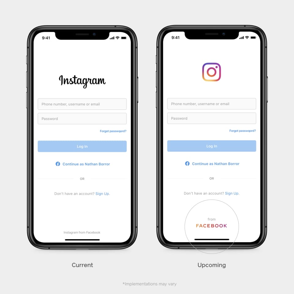
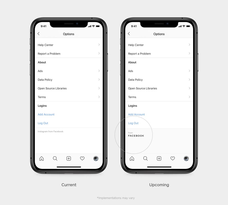
We started being clearer about the products and services that are part of Facebook years ago, adding a company endorsement to products like Oculus, Workplace and Portal. And in June we began including “from Facebook” within all our apps.
Over the coming weeks, we will start using the new brand within our products and marketing materials, including a new company website.
This brand change is a way to better communicate our ownership structure to the people and businesses who use our services to connect, share, build community and grow their audiences.
Reports also speculate that, the change in logo and deliberate efforts at distinction between the company and its other products and services, may just be a step to placating the U.S Congress, as a form of divestiture of its acquisition.

