Apple is dialing back the transparency in its new iOS 26 Liquid Glass design, following feedback from early testers. In the third developer beta of iOS 26, the tech giant has made key visual adjustments to navigation bars, buttons, and tab elements making them appear more frosted and less transparent.
This change builds on Apple’s earlier decision to scale back the glassy look introduced at WWDC. While Liquid Glass was originally meant to create a sleek, futuristic aesthetic with clear visual layering, many users criticized it for making interface elements difficult to read—particularly icons in the Control Center.
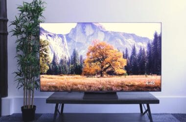
With iOS 26 beta 3, Apple has made these UI elements even more solid and less see-through. The aim appears to be improving readability and usability, especially in apps where too much transparency interfered with legibility.
However, the latest change has sparked mixed reactions. Some developers and testers see it as a necessary step toward functionality, while others feel Apple is backtracking on its bold design vision. Sam Kohl, developer of AppleTrack, commented on X:
“iOS 26 beta 3 completely nerfs Liquid Glass. It looks so much cheaper now and feels like Apple is backtracking on their original vision.”
Other users voiced similar concerns, calling the update a “step backward” and urging Apple to “stop ruining” the design language they were initially excited about.
Interestingly, transparency levels now appear to vary slightly across apps suggesting that Apple is still fine-tuning Liquid Glass based on context and usability.
With the public release of iOS 26 expected in September 2025, Apple still has time to iterate. Whether the final version will strike the right balance between visual flair and user-friendly design remains to be seen.