According to a press release by Konga.com, Nigeria’s largest online market place has redesigned its website into something cleaner and more user friendly. I personally like the user interface of the new website.
Find the Press Release Below:
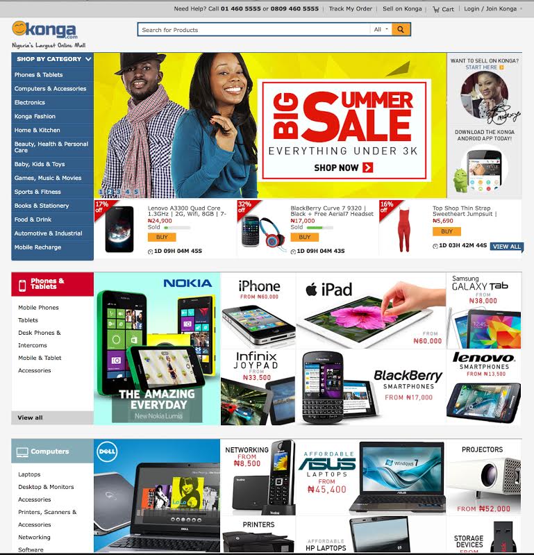
The new Konga website design is quite different from the old one although it has a similar structure. The category panel remains on the left and the search bar is still displayed at the top of the homepage.
What instantly strikes one about the website is the colourful display of product banners. It makes the website look very attractive. It also helps make navigation much easier. For instance, if you click on the Fashion from Le Rouge banner, it takes you to a page where only fashion products from Le Rouge are displayed, thus helping you streamline your search. At the top of the page are filters that help you streamline further. You can filter by category, price and brand. To the left, the Konga website features a category drop down panel. And then, the sub categories are also displayed below to ensure that users can see all at a glance.
The pop of colours used, and the dominating blue gives the homepage some much needed contrast, and makes it easier for users to locate different categories. It’s also a smart way for Konga to put various brands at strategic locations on the Konga homepage to give them more visibility.
To add a touch of eclat is screen diva, Omotola’s picture and signature at the top right corner of the Konga homepage. When you click on this tab, it directs you to the seller sign-up page where you can register to merchant on Konga.com.
Ultimately, this new design is built around promoting customer satisfaction, and providing a better shopping experience.
Do you like this new design? Share your thoughts!
As an Amazon Associate, TechCity may earn a small commission if you shop these products.

Owala FreeSip Insulated Stainless Steel Water Bottle with Straw for Sports and Travel, BPA-Free, 24-oz, Shy Marshmallow
$23.00 (as of April 24, 2024 07:25 GMT +01:00 - More infoProduct prices and availability are accurate as of the date/time indicated and are subject to change. Any price and availability information displayed on [relevant Amazon Site(s), as applicable] at the time of purchase will apply to the purchase of this product.)
3-Pack [3.3FT+6.6FT+10FT] 60W USB C to USB C Cable, Type C to Type C Cable,Fast Charging Cable Compatible with iPhone 15/Plus/15 Pro/Pro Max,Samsung Galaxy S23 S22, iPad Pro, MacBook Air and More
$9.83 (as of April 24, 2024 07:25 GMT +01:00 - More infoProduct prices and availability are accurate as of the date/time indicated and are subject to change. Any price and availability information displayed on [relevant Amazon Site(s), as applicable] at the time of purchase will apply to the purchase of this product.)
Ailun Glass Screen Protector for iPhone 14 / iPhone 13 / iPhone 13 Pro [6.1 Inch] Display 3 Pack Tempered Glass, Case Friendly
$5.98 (as of April 24, 2024 07:25 GMT +01:00 - More infoProduct prices and availability are accurate as of the date/time indicated and are subject to change. Any price and availability information displayed on [relevant Amazon Site(s), as applicable] at the time of purchase will apply to the purchase of this product.)
CELSIUS Assorted Flavors Official Variety Pack, Functional Essential Energy Drinks, 12 Fl Oz (Pack of 12)
$28.99 (as of April 24, 2024 07:25 GMT +01:00 - More infoProduct prices and availability are accurate as of the date/time indicated and are subject to change. Any price and availability information displayed on [relevant Amazon Site(s), as applicable] at the time of purchase will apply to the purchase of this product.)
Sparkling Ice, Black Raspberry Sparkling Water, Zero Sugar Flavored Water, with Vitamins and Antioxidants, Low Calorie Beverage, 17 fl oz Bottles (Pack of 12)
$10.98 (as of April 24, 2024 07:25 GMT +01:00 - More infoProduct prices and availability are accurate as of the date/time indicated and are subject to change. Any price and availability information displayed on [relevant Amazon Site(s), as applicable] at the time of purchase will apply to the purchase of this product.)
Anker 553 USB-C Hub, 8-in-1 USB C Dock, Dual 4K HDMI USB C to USB Adapter, 1 Gbps Ethernet USB Hub, 100W Power Delivery, SD Card Reader for MacBook Pro, XPS and More
$39.99 (as of April 23, 2024 07:25 GMT +01:00 - More infoProduct prices and availability are accurate as of the date/time indicated and are subject to change. Any price and availability information displayed on [relevant Amazon Site(s), as applicable] at the time of purchase will apply to the purchase of this product.)
Amazon Fire Max 11 tablet, vivid 11” display, all-in-one for streaming, reading, and gaming, 14-hour battery life, optional stylus and keyboard, 64 GB, Gray
$179.99 (as of April 23, 2024 07:25 GMT +01:00 - More infoProduct prices and availability are accurate as of the date/time indicated and are subject to change. Any price and availability information displayed on [relevant Amazon Site(s), as applicable] at the time of purchase will apply to the purchase of this product.)
Acer Aspire 3 A315-24P-R7VH Slim Laptop | 15.6" Full HD IPS Display | AMD Ryzen 3 7320U Quad-Core Processor | AMD Radeon Graphics | 8GB LPDDR5 | 128GB NVMe SSD | Wi-Fi 6 | Windows 11 Home in S Mode
$299.99 (as of April 23, 2024 07:25 GMT +01:00 - More infoProduct prices and availability are accurate as of the date/time indicated and are subject to change. Any price and availability information displayed on [relevant Amazon Site(s), as applicable] at the time of purchase will apply to the purchase of this product.)
All-new Amazon Fire HD 10 tablet, built for relaxation, 10.1" vibrant Full HD screen, octa-core processor, 3 GB RAM, latest model (2023 release), 32 GB, Black
$139.99 (as of April 23, 2024 07:25 GMT +01:00 - More infoProduct prices and availability are accurate as of the date/time indicated and are subject to change. Any price and availability information displayed on [relevant Amazon Site(s), as applicable] at the time of purchase will apply to the purchase of this product.)